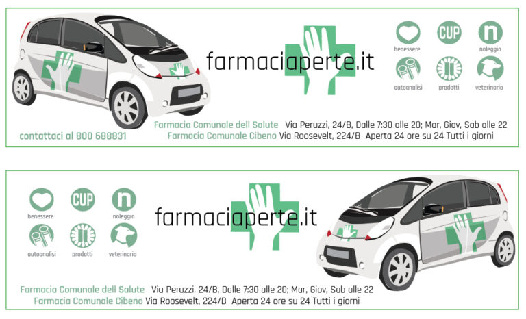
I was not asked to design a new logo for the holding company Didasko but it became apparent that they needed one. The big discussion, which the logo needed to resolve, was where the emphasis would be. Meaning, this can be read as Farmaci-aperte (Pharmacy Open or Open Pharmacy) or as Farmacia-per te (Pharmacy for you). We settled on the later and the words that appear within the cross emphasis the people focus of our entire branding campaign.
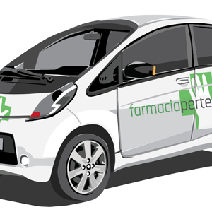
The brand then is extended over advertising, brochures, on-site wall and window graphics, and the actual delivery cars.